Flutter RaisedButton Widget
In Flutter, RaisedButton widget is a material design, that has a rectangular body and hovers over the interface, thus creating a shadow.
In this tutorial, we will learn how to create a RaisedButton widget in your Flutter Application.
Following is the quick code snippet to create a RaisedButton.
child: RaisedButton(
  onPressed: () => {},
  child: Text('Submit'),
  //other properties
),
Example: Flutter RaisedButton
In this example Flutter Application, we created a Raised Button.
main.dart
import 'package:flutter/material.dart';
void main() {
runApp(MaterialApp(
home: MyApp(),
));
}
class MyApp extends StatefulWidget {
@override
_State createState() => _State();
}
class _State extends State<MyApp> {
@override
Widget build(BuildContext context) {
return Scaffold(
appBar: AppBar(
title: Text('Flutter Tutorial'),
),
body: Center(
child: RaisedButton(
onPressed: () => {},
child: Text('Raised Button'),
),
),
);
}
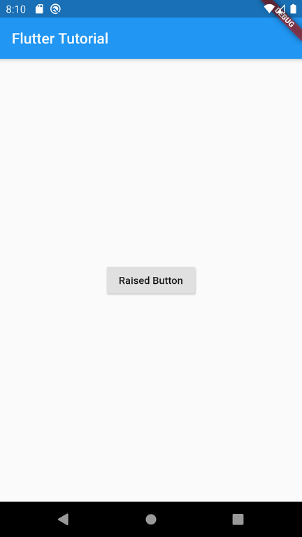
}Run the above application in an Android smartphone or Android Simulator, and you should see the raised button as shown below.
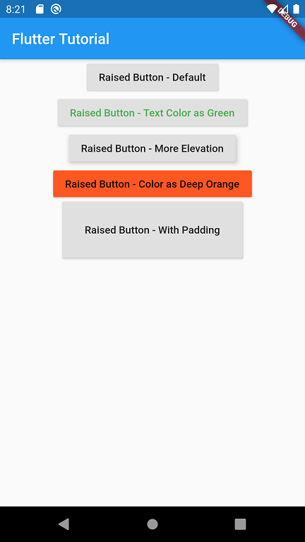
Example: Flutter RaisedButton with different properties
You can change some of the properties of RaisedButton to suit the look and feel of your Android or Apple application. In this example, we have set some properties like elevation, text color, button color, padding, etc.
main.dart
import 'package:flutter/material.dart';

void main() {
  runApp(new MaterialApp(
    home: new MyApp(),
  ));
}

class MyApp extends StatefulWidget {
  @override
  _State createState() => new _State();
}

class _State extends State<MyApp> {
  @override
  Widget build(BuildContext context) {
    return new Scaffold(
      appBar: new AppBar(
        title: new Text('Flutter Tutorial'),
      ),
      body: new Center(
          child: new Column(children: <Widget>[
            new RaisedButton(
              onPressed: () => {},
              child: new Text('Raised Button - Default'),
            ),
            new RaisedButton(
              onPressed: () => {},
              child: new Text('Raised Button - Text Color as Green'),
              textColor: Colors.green,
            ),
            new RaisedButton(
              onPressed: () => {},
              child: new Text('Raised Button - More Elevation'),
              elevation: 5,
            ),
            new RaisedButton(
              onPressed: () => {},
              child: new Text('Raised Button - Color as Deep Orange'),
              color: Colors.deepOrange,
            ),
            new RaisedButton(
              onPressed: () => {},
              child: new Text('Raised Button - With Padding'),
              padding: new EdgeInsets.all(30),
            ),

      ])),
    );
  }
}
Screenshot
Summary
In this Flutter Tutorial, we learned how to create and set some of the properties for Flutter RaisedButton widget, with the help of well detailed example applications.