Custom Shape for FloatingActionButton
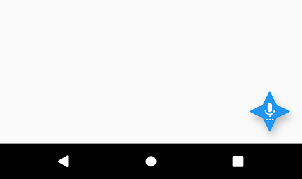
You can specify custom shaped backgrounds to FloatingActionButton like the one shown below.

All you need to do is some painting in the Canvas. Of course using Flutter.
floatingActionButton of Scaffold accepts shape property. We are going to build a custom ShapeBorder and assign this object to the shape property of FloatingActionButton.
Example 1: Custom Background Shape for FloatingActionButton
In this example, we are going to build a custom background shape for FloatingActionButton, as shown in the above figure.
main.dart
import 'package:flutter/material.dart';

void main() {
  runApp(MaterialApp(
    home: MyApp(),
  ));
}

class MyApp extends StatefulWidget {
  @override
  _MyAppState createState() => _MyAppState();
}

class _MyAppState extends State<MyApp> {

  @override
  Widget build(BuildContext context) {
    return Scaffold(
      appBar: AppBar(
        title: new Text("Flutter Tutorial - googleflutter.com"),
      ),
      floatingActionButton: FloatingActionButton(
        onPressed: (){},
        child: Icon(Icons.settings_voice),
        shape: _CustomBorder(),
      ),
    );
  }
}


class _CustomBorder extends ShapeBorder {
  const _CustomBorder();

  @override
  EdgeInsetsGeometry get dimensions {
    return const EdgeInsets.only();
  }

  @override
  Path getInnerPath(Rect rect, { TextDirection textDirection }) {
    return getOuterPath(rect, textDirection: textDirection);
  }

  @override
  Path getOuterPath(Rect rect, { TextDirection textDirection }) {
    return Path()
      ..moveTo(rect.left + rect.width / 2.0, rect.top)
      ..lineTo(rect.right - rect.width / 3, rect.top + rect.height / 3)
      ..lineTo(rect.right, rect.top + rect.height / 2.0)
      ..lineTo(rect.right - rect.width / 3, rect.top + 2*rect.height / 3)
      ..lineTo(rect.left + rect.width  / 2.0, rect.bottom)
      ..lineTo(rect.left + rect.width / 3, rect.top + 2*rect.height / 3)
      ..lineTo(rect.left, rect.top + rect.height / 2.0)
      ..lineTo(rect.left + rect.width / 3, rect.top + rect.height / 3)
      ..close();
  }

  @override
  void paint(Canvas canvas, Rect rect, { TextDirection textDirection }) {}

  // This border doesn't support scaling.
  @override
  ShapeBorder scale(double t) {
    return null;
  }
}
We have created a new class _CustomBorder that extends ShapeBorder. In this class, we have to override some of the methods of ShapeBorder.
The method that we need to focus is getOuterPath(). In this method, we return a Path object. If you observe the above example, we have used moveTo(), lineTo() and close() methods to build the custom shape. Also, make sure that you do not specify a point outside the rectangle. We have to draw our custom shape in this rectangle.
Let us understand the code used to draw the shape.
moveTo(rect.left + rect.width / 2.0, rect.top) moves the pointer to top corner of the shape.
lineTo(rect.right - rect.width / 3, rect.top + rect.height / 3) draws line from the pointer to the corner between top and right.
lineTo(rect.right, rect.top + rect.height / 2.0) draws the line from previous pointer position to the right corner.
These three lines of code have drawn only 25% of the shape from top to right. The rest of the lineTo() method calls complete the shape and you have to close() the path at the end.
Screenshot
Summary
In this Flutter Tutorial, we learned how to provide a custom shape to FloatingActionButton of Scaffold.