Flutter ElevatedButton Border Width/Color/Style
To set specific border width, border color, or border style for ElevatedButton widget, set side property of this ElevatedButton with required BorderSide value containing width, color, and style properties.
Syntax
ElevatedButton(
  child: const Text('Submit'),
  onPressed: () {},
  style: ElevatedButton.styleFrom(
    side: const BorderSide(
      width: 2,
      color: Colors.redAccent,
      style: BorderStyle.solid),
    ),
  ),
),
Example
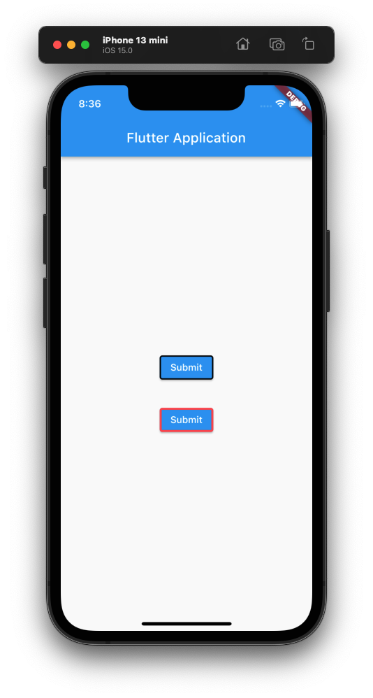
Flutter Application with two ElevatedButton widgets. First button is set with width of 2, color of Colors.black, and style of solid. Second button is set with width of 3, color of Colors.redAccent, and style of solid.
main.dart
import 'package:flutter/material.dart';

void main() => runApp(const MyApp());

/// main application widget
class MyApp extends StatelessWidget {
  const MyApp({Key? key}) : super(key: key);

  static const String _title = 'Flutter Application';

  @override
  Widget build(BuildContext context) {
    return MaterialApp(
      title: _title,
      home: Scaffold(
        appBar: AppBar(title: const Text(_title)),
        body: const MyStatefulWidget(),
      ),
    );
  }
}

/// stateful widget that the main application instantiates
class MyStatefulWidget extends StatefulWidget {
  const MyStatefulWidget({Key? key}) : super(key: key);

  @override
  State<MyStatefulWidget> createState() => _MyStatefulWidgetState();
}

/// private State class that goes with MyStatefulWidget
class _MyStatefulWidgetState extends State<MyStatefulWidget> {
  @override
  Widget build(BuildContext context) {
    return Center(
      child: Column(
        mainAxisAlignment: MainAxisAlignment.center,
        children: <Widget>[
          ElevatedButton(
            child: const Text('Submit'),
            onPressed: () {},
            style: ElevatedButton.styleFrom(
              side: const BorderSide(
                width: 2,
                color: Colors.black,
                style: BorderStyle.solid),
            ),
          ),
          const SizedBox(height: 30,),
          ElevatedButton(
            child: const Text('Submit'),
            onPressed: () {},
            style: ElevatedButton.styleFrom(
              side: const BorderSide(
                width: 3,
                color: Colors.redAccent,
                style: BorderStyle.solid),
            ),
          ),
        ],
      ),
    );
  }
}
Screenshot