Flutter CupertinoButton – Disabled Color
To set the disabled color of a CupertinoButton in Flutter, set the disabledColor property with the required Color value.
Syntax
Disable CupertinoButton with specific disabled color value.
CupertinoButton(
  onPressed: null,
  child: const Text('Button'),
  color: Colors.blue,
  disabledColor: Colors.grey,
)
color attribute must be set for disabledColor to take effect.
Example
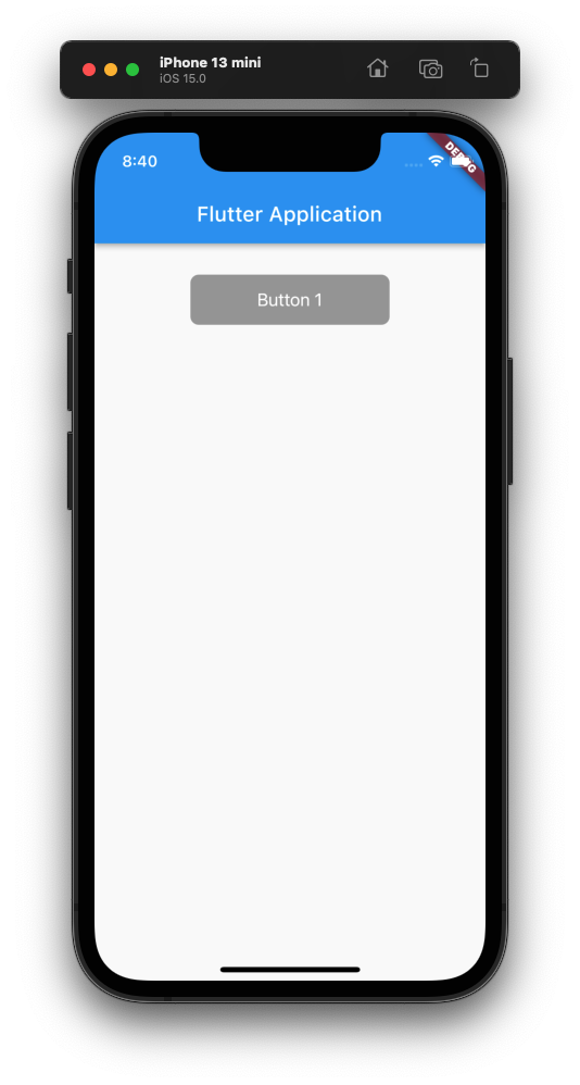
Flutter Application with a disabled CupertinoButton widget.
The disabled color of CupertinoButton widget Button is set to Colors.grey.
main.dart
import 'package:flutter/cupertino.dart';
import 'package:flutter/material.dart';

void main() => runApp(const MyApp());

/// main application widget
class MyApp extends StatelessWidget {
  const MyApp({Key? key}) : super(key: key);

  static const String _title = 'Flutter Application';

  @override
  Widget build(BuildContext context) {
    return MaterialApp(
      title: _title,
      home: Scaffold(
        appBar: AppBar(title: const Text(_title)),
        body: const MyStatefulWidget(),
      ),
    );
  }
}

/// stateful widget that the main application instantiates
class MyStatefulWidget extends StatefulWidget {
  const MyStatefulWidget({Key? key}) : super(key: key);

  @override
  State<MyStatefulWidget> createState() => _MyStatefulWidgetState();
}

/// private State class that goes with MyStatefulWidget
class _MyStatefulWidgetState extends State<MyStatefulWidget> {
  @override
  Widget build(BuildContext context) {
    return Center(
        child: Column(
          children: const <Widget>[
            SizedBox(height: 30,),
            CupertinoButton(
              onPressed: null,
              child: Text('Button 1'),
              color: Colors.blue,
              disabledColor: Colors.grey,
            ),
          ],
        ),
    );
  }
}
Screenshot