Container Widget – Different Border at Left, Right, Top or Bottom Borders
You can specify different border widths and colors to Container widget using its decoration property.
A skeletal quick code snippet to provide different borders for a Container is given below.
Container(

  decoration: BoxDecoration(
	  border: Border(
		  left: BorderSide(
			color: Colors.green,
			width: 5,
		  ),
		  top: BorderSide(
			color: Colors.indigo,
			width: 7,
		  ),
		  right: BorderSide(
			color: Colors.black45,
			width: 5,
		  ),
		  bottom: BorderSide(
			color: Colors.orange,
			width: 20,
		  ))),
),
The left, top, right and bottom properties are optional. You may provide only those borders that are required as per your Android or IOS application built using Google’s Flutter.
Example – Change Border’s width and color differently for all the sides of Container
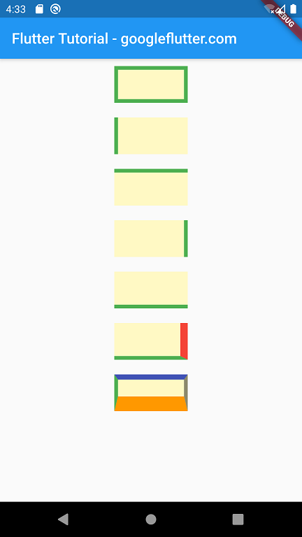
In this example Flutter Application, we have built many Container widgets covering different scenarios of provides only a single side border, or different border widths and colors at different sides: left, top, right and bottom.
main.dart
import 'package:flutter/material.dart';

void main() {
  runApp(MyApp());
}

class MyApp extends StatefulWidget {
  @override
  _MyAppState createState() => _MyAppState();
}

class _MyAppState extends State<MyApp> {
  @override
  Widget build(BuildContext context) {
    return MaterialApp(
      home: Scaffold(
          appBar: AppBar(
            title: Text('Flutter Tutorial - googleflutter.com'),
          ),
          body: Center(
              child: Column(children: <Widget>[
            Container(
              alignment: Alignment.center,
              width: 100,
              height: 50,
              margin: EdgeInsets.all(10),
              padding: EdgeInsets.all(5),
              child: Text(''),
              decoration: BoxDecoration(
                  color: Colors.yellow[100],
                  border: Border.all(
                    color: Colors.green,
                    width: 5,
                  )),
            ),
            Container(
              alignment: Alignment.center,
              width: 100,
              height: 50,
              margin: EdgeInsets.all(10),
              padding: EdgeInsets.all(5),
              child: Text(''),
              decoration: BoxDecoration(
                  color: Colors.yellow[100],
                  border: Border(
                      left: BorderSide(
                    color: Colors.green,
                    width: 5,
                  ))),
            ),
            Container(
              alignment: Alignment.center,
              width: 100,
              height: 50,
              margin: EdgeInsets.all(10),
              padding: EdgeInsets.all(5),
              child: Text(''),
              decoration: BoxDecoration(
                  color: Colors.yellow[100],
                  border: Border(
                      top: BorderSide(
                    color: Colors.green,
                    width: 5,
                  ))),
            ),
            Container(
              alignment: Alignment.center,
              width: 100,
              height: 50,
              margin: EdgeInsets.all(10),
              padding: EdgeInsets.all(5),
              child: Text(''),
              decoration: BoxDecoration(
                  color: Colors.yellow[100],
                  border: Border(
                      right: BorderSide(
                    color: Colors.green,
                    width: 5,
                  ))),
            ),
            Container(
              alignment: Alignment.center,
              width: 100,
              height: 50,
              margin: EdgeInsets.all(10),
              padding: EdgeInsets.all(5),
              child: Text(''),
              decoration: BoxDecoration(
                  color: Colors.yellow[100],
                  border: Border(
                      bottom: BorderSide(
                        color: Colors.green,
                        width: 5,
                      ),
                      right: BorderSide(
                        color: Colors.red,
                        width: 10,
                      ))),
            ),
            Container(
              alignment: Alignment.center,
              width: 100,
              height: 50,
              margin: EdgeInsets.all(10),
              padding: EdgeInsets.all(5),
              child: Text(''),
              decoration: BoxDecoration(
                  color: Colors.yellow[100],
                  border: Border(
                      left: BorderSide(
                        color: Colors.green,
                        width: 5,
                      ),
                      top: BorderSide(
                        color: Colors.indigo,
                        width: 7,
                      ),
                      right: BorderSide(
                        color: Colors.black45,
                        width: 5,
                      ),
                      bottom: BorderSide(
                        color: Colors.orange,
                        width: 20,
                      ))),
            ),
          ]))),
    );
  }
}
Screenshot
Summary
In this Flutter Tutorial, we learned how to provide borders for a Container widget at left, top, right and bottom individually or in combinations.