Flutter Checkbox Widget
Flutter Checkbox widget displays a material design checkbox.
Using Checkbox class properties, we may change the colors, and also listen to the state changes.
Syntax
Checkbox(
  value: false,
  onChanged: () {},
),
Example
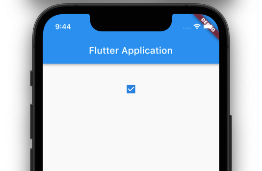
Flutter Application with a Checkbox widget.
isChecked boolean variable is used to hold the state of this Checkbox widget, whether checked (true) or not (false).
main.dart
import 'package:flutter/material.dart';

void main() => runApp(const MyApp());

/// main application widget
class MyApp extends StatelessWidget {
  const MyApp({Key? key}) : super(key: key);

  static const String _title = 'Flutter Application';

  @override
  Widget build(BuildContext context) {
    return MaterialApp(
      title: _title,
      home: Scaffold(
        appBar: AppBar(title: const Text(_title)),
        body: const MyStatefulWidget(),
      ),
    );
  }
}

/// stateful widget that the main application instantiates
class MyStatefulWidget extends StatefulWidget {
  const MyStatefulWidget({Key? key}) : super(key: key);

  @override
  State<MyStatefulWidget> createState() => _MyStatefulWidgetState();
}

/// private State class that goes with MyStatefulWidget
class _MyStatefulWidgetState extends State<MyStatefulWidget> {
  bool isChecked = false;
  @override
  Widget build(BuildContext context) {
    return Center(
      child: Column(
        children: <Widget>[
          const SizedBox(height: 30,),
          Checkbox(
            checkColor: Colors.white,
            value: isChecked,
            onChanged: (bool? value) {
              setState(() {
                isChecked = value!;
              });
            },
          ),
        ],
      ),
    );
  }
}
Video